
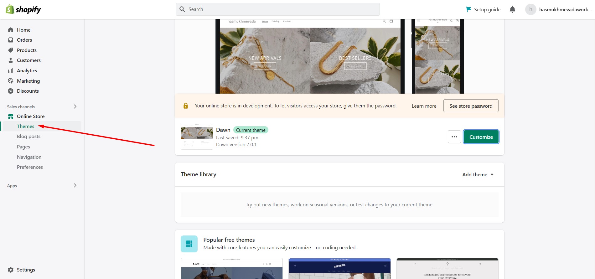
Click On Shopify store

Choose theme option
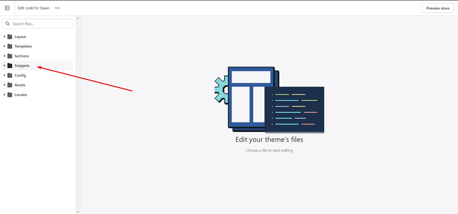
Click on beside customization toggle button

Click on Edit Code

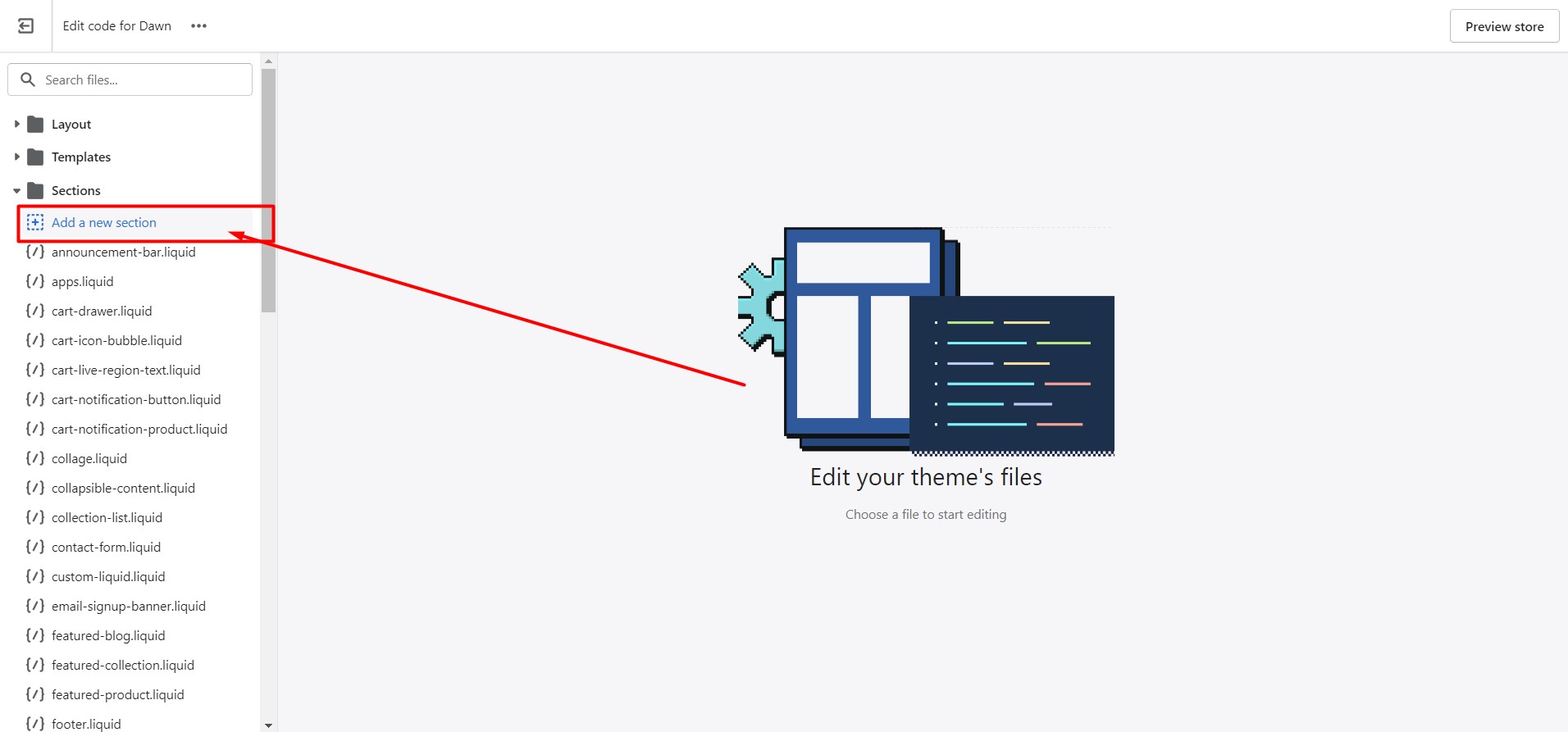
Click On New Section
Create add a new section
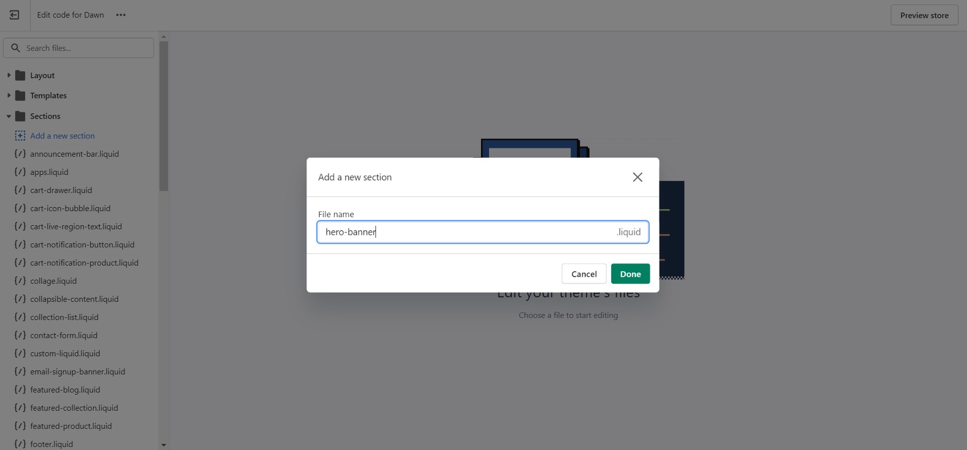
Create New file
Copy paste these code
Html Code
<section class="hm-widget-banner">
    <div class="container-full">
        <div class="hero-section__inner">
            <div class="hero-section__content">
                <div class="row--banners">
                    <div class="col-banner">
                        <div class="featured-banner">
                            <div class="hm-image">
                                <a href="/">
                                    <img class="img-fluid noscript" src="//cdn.shopify.com/s/files/1/0673/3588/1018/files/1_9df6c433-ab6b-4787-9bee-02b058bca7ef.jpg?crop=center&height=730&v=1667811711&width=960" width="960" height="730" />
                                </a>
                            </div>
                            <div class="banner-wrapper-infor position-absolute">
                                <div class="info">
                                    <div class="content">
                                        <h3 class="title-banner">New Arrivals</h3>
                                        <a class="hm-button" href="/"><span>Shop Now</span></a>
                                    </div>
                                </div>
                            </div>
                        </div>
                    </div>
                    <div class="col-banner">
                        <div class="featured-banner">
                            <div class="hm-image">
                                <a href="/"><img class="img-fluid noscript" src="//cdn.shopify.com/s/files/1/0673/3588/1018/files/2_d717e989-b453-495e-ba17-f080be5e3f1f.jpg?crop=center&height=730&v=1667811724&width=960" width="960" height="730" />
                                </a>
                            </div>
                            <div class="banner-wrapper-infor position-absolute">
                                <div class="info">
                                    <div class="content">
                                        <h3 class="title-banner">Best Sellers</h3>
                                        <a class="hm-button" href="/"><span>Shop Now</span></a>
                                    </div>
                                </div>
                            </div>
                        </div>
                    </div>
                </div>
            </div>
        </div>
    </div>
</section>
Css Code
.hero-section .overflow-hidden {
    overflow: hidden!important;
}
.hero-section .hm-widget-banner .row--banners {
    display: flex;
    flex-wrap: wrap;
}
.hero-section .hm-widget-banner .featured-banner {
    position: relative;
}
.hero-section .featured-banner {
    position: relative;
    overflow: hidden;
}
.hero-section .fade-in.lazyloaded {
    opacity: 1;
    transform: scale(1);
}
.hero-section .featured-banner img {
    display: block;
    width: 100%;
    max-width: 100%;
    transition: all .5s ease-in-out;
    height: auto;
}
.hero-section .fade-in {
    transform: scale(1.1);
    opacity: 0;
    transition: transform .8s cubic-bezier(.215,.61,.355,1),opacity .8s cubic-bezier(.215,.61,.355,1);
    transition-delay: .5s;
}
.hero-section .position-absolute {
    position: absolute!important;
}
.hero-section .hm-widget-banner .banner-wrapper-infor {
    width: 100%;
    display: flex;
}
.hero-section .hm-widget-banner .title-banner {
    font-size: 36px;
    margin-bottom: 5px;
    margin-top: 0;
    text-transform: uppercase;
    color: #ffffff;
}
.hero-section .hm-button {
    font-size: 12px;
    text-transform: uppercase;
    letter-spacing: 3px;
    border: 2px solid white;
    padding: 12px 30px;
    color: #fff;
    text-decoration: none;
    display: inline-block!important;
}
.hero-section .hm-button:hover{
    background-color: #ffffff;
    color: #000;
}
.hero-section .hm-widget-banner .col-banner {
    max-width: 50%;
    flex: 0 0 50%;
}
.hero-section .hm-widget-banner .col-banner .banner-wrapper-infor {
    padding: 0 15px;
    justify-content: center;
    text-align: center;
}
.hero-section .hm-widget-banner .col-banner .banner-wrapper-infor.position-absolute {
    top: 50%;
    transform: translateY(-50%);
}
@media (max-width: 1199px){
  .hero-section .hm-widget-banner .title-banner {
    font-size: 34px;
  }
}
@media (max-width: 991px){
  .hero-section .hm-widget-banner .title-banner {
    font-size: 32px;
  }
}
@media (max-width: 767px){
    .hero-section .hm-widget-banner .col-banner {
        max-width: 100%;
        flex: 0 0 100%;
    }
    .hero-section .hm-widget-banner .title-banner {
        font-size: 30px;
    }
}
@media (max-width: 575px){
    .hero-section .hm-widget-banner .title-banner {
        font-size: 28px;
    }
}
Schema Code
{% schema %}
  {
    "name": "Hero Banner 1",
    "class": "hero-section",
    "settings": [],
    "presets": [
      {
        "name": "Hero Banner 1"
      }
    ]
  }
{% endschema %}
Final Code
<style type="text/css">
	.hero-section .overflow-hidden {
	    overflow: hidden!important;
	}
	.hero-section .hm-widget-banner .row--banners {
	    display: flex;
	    flex-wrap: wrap;
	}
	.hero-section .hm-widget-banner .featured-banner {
	    position: relative;
	}
	.hero-section .featured-banner {
	    position: relative;
	    overflow: hidden;
	}
	.hero-section .fade-in.lazyloaded {
	    opacity: 1;
	    transform: scale(1);
	}
	.hero-section .featured-banner img {
	    display: block;
	    width: 100%;
	    max-width: 100%;
	    transition: all .5s ease-in-out;
        height: auto;
	}
	.hero-section .fade-in {
	    transform: scale(1.1);
	    opacity: 0;
	    transition: transform .8s cubic-bezier(.215,.61,.355,1),opacity .8s cubic-bezier(.215,.61,.355,1);
	    transition-delay: .5s;
	}
	.hero-section .position-absolute {
	    position: absolute!important;
	}
	.hero-section .hm-widget-banner .banner-wrapper-infor {
	    width: 100%;
	    display: flex;
	}
	.hero-section .hm-widget-banner .title-banner {
	    font-size: 36px;
	    margin-bottom: 5px;
	    margin-top: 0;
	    text-transform: uppercase;
	    color: #ffffff;
	}
	.hero-section .hm-button {
	    font-size: 12px;
	    text-transform: uppercase;
	    letter-spacing: 3px;
	    border: 2px solid white;
	    padding: 12px 30px;
	    color: #fff;
	    text-decoration: none;
	    display: inline-block!important;
	}
	.hero-section .hm-button:hover{
		background-color: #ffffff;
		color: #000;
	}
	.hero-section .hm-widget-banner .col-banner {
	    max-width: 50%;
	    flex: 0 0 50%;
	}
	.hero-section .hm-widget-banner .col-banner .banner-wrapper-infor {
	    padding: 0 15px;
	    justify-content: center;
	    text-align: center;
	}
	.hero-section .hm-widget-banner .col-banner .banner-wrapper-infor.position-absolute {
	    top: 50%;
	    transform: translateY(-50%);
	}
    @media (max-width: 1199px){
      .hero-section .hm-widget-banner .title-banner {
	    font-size: 34px;
      }
    }
    @media (max-width: 991px){
      .hero-section .hm-widget-banner .title-banner {
	    font-size: 32px;
      }
    }
	@media (max-width: 767px){
		.hero-section .hm-widget-banner .col-banner {
		    max-width: 100%;
		    flex: 0 0 100%;
		}
        .hero-section .hm-widget-banner .title-banner {
    	    font-size: 30px;
        }
	}
    @media (max-width: 575px){
        .hero-section .hm-widget-banner .title-banner {
    	    font-size: 28px;
        }
    }
</style>
<section class="hm-widget-banner">
	<div class="container-full">
		<div class="hero-section__inner">
			<div class="hero-section__content">
				<div class="row--banners">
                  {% for block in section.blocks %}
                    {% case block.type %}
                      {% when 'box' %}
                      {% if block.settings.box_img != blank %}
                      <div class="col-banner">
                          <div class="featured-banner">
                              <div class="hm-image">
                                  <a href="{{ block.settings.btn_link }}">
                                      <img class="img-fluid noscript" src="{{ block.settings.box_img | image_url: width: 2048 }}" width="960" height="730" alt=""/>
                                  </a>
                              </div>
                              {% if block.settings.box_img != blank %}
                              <div class="banner-wrapper-infor position-absolute">
                                  <div class="info">
                                      <div class="content">
                                          <h3 class="title-banner">{{ block.settings.title }}</h3>
                                          {% if block.settings.btn != blank %}
                                          <a class="hm-button" href="{{ block.settings.btn_link }}"><span>{{ block.settings.btn }}</span></a>
                                          {% endif %}
                                      </div>
                                  </div>
                              </div>
                              {% endif %}
                          </div>
                      </div>
                      {% endif %}
                  	{% endcase %}
                  {% endfor %}
				</div>
			</div>
		</div>
	</div>
</section>
{% schema %}
  {
    "name": "Hero Banner 1",
    "class": "hero-section",
    "settings": [],
    "max_blocks": 4,
    "blocks": [
       {
         "name": "Hero Box",
         "type": "box",
         "settings": [
           {
              "type": "image_picker",
              "id": "box_img",
              "label": "Column Image"
           },
           {
              "type": "text",
              "id": "title",
              "default": "New Arrivals",
              "label": "Title"
           },
           {
              "type": "text",
              "id": "btn",
              "default": "Button Text",
              "label": "Shop Now"
           },
           {
              "type": "url",
              "id": "btn_link",
              "label": "Button URL"
           }
         ]
       }
    ],
    "presets": [
      {
        "name": "Hero Banner 1"
      }
    ]
  }
{% endschema %}

{% stylesheet %}
{% endstylesheet %}

{% javascript %}
{% endjavascript %}